Which Bag Stands Out? Comparing Kai Coffee’s 7oz and 12oz Looks

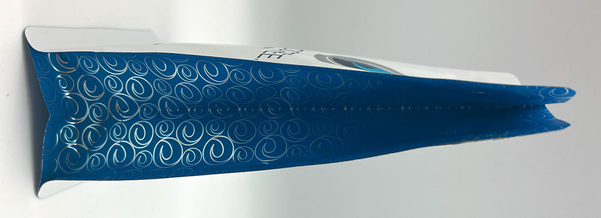
Kai Coffee Hawai'i is known for its premium beans, but their packaging deserves attention too. We took a closer look at two different bags, a 7oz and a 12oz, to compare their finish, feel, and printing style. At first glance, the differences are subtle. But with a closer look, the details begin to stand out.

1. Dark Blue Bag: Glossy Shine and Strong Depth

The dark blue bag stands out right away. It reflects light and has a shiny surface that gives it a polished, premium appearance. The colors feel deeper and more layered, almost like there's more going on beneath the surface. It gives off a high-end vibe just from how it looks and feels.
  • Key Highlights:
  • Glossy finish with reflective foil effect
  • Strong visual depth and detail
  • Appears layered and dimensional
  • Eye-catching in both texture and color

2. White Bag: Matte Texture with a Smooth Feel

In contrast, the white bag has a matte look. It doesn’t reflect light the same way. The texture feels soft and smooth in the hand. The print appears flatter and more classic. It gives a minimal, clean style that feels modern but less showy than the blue bag. What You’ll Notice:
  • Matte finish with soft-touch texture
  • No shine or reflection
  • Simpler, more traditional feel
  • Subtle and understated design
KaiSideways

Can You Tell the Print Type? Here's the Reveal

At first, the glossy blue bag might look like it has the more advanced printing. But the truth is the opposite. Dark Blue Bag is digitally printed:
  • Uses transparent ink
  • No white ink layer
  • Foil layer beneath shows through
  • Adds shine and dimension
  • Great for smaller order runs
White Bag is rotogravure printed:
  • Matte ink with full coverage
  • No transparent ink
  • Features soft-touch finish
  • Best for high-volume production
What’s surprising is that most would guess the blue bag is rotogravure. It looks like it has more technical work behind it. But the digital version is the one with the flashier look thanks to transparent ink over the foil. That’s the power of modern digital printing.

Why This Matters for Coffee Brands

If you’re starting a new coffee brand or looking to refresh your packaging, here’s the takeaway. Digital printing can offer high-end looks without needing to commit to huge quantities. It’s flexible, fast, and cost-effective for small to mid-size batches. You don’t have to sacrifice visual impact to get your product on shelves.

Other Blogs of Interest