

Why Less Is Winning: The 2026 Case for Minimalist Coffee and Food Packaging Design
Walk the specialty food aisle of any premium grocery store today and the pattern is hard to miss. The bags pulling your eye are not the ones with the most information on them. They are the ones with the least. A kraft paper pouch with a single bold logo and nothing else. A matte flat bottom bag in warm oat white with the origin name in large type and generous space around it. A natural paper side-gusset with a minimal illustration and room for the eye to rest. These are not accidental designs. They are intentional, strategic choices by brands that understood something important before their competitors did: restraint is now a competitive advantage. Minimalist packaging design has become one of the clearest shelf strategies in the coffee and food industry for 2026. Understanding why it is winning, what is driving it, and how to apply it is one of the more useful exercises a brand can do before its next packaging update.Why the Shelf Has Gotten Quieter
The visual noise level on retail shelves climbed steadily through the 2010s. Categories got more crowded, brands added more elements to compete for attention, and the result was aisles where everything was shouting at the same volume. When everyone shouts, nobody lands. The counter-strategy emerged first in specialty coffee and has since spread across premium food, natural snacks, wellness products, and artisanal goods. The logic is straightforward: when everything around you is maximalist, the brand that speaks clearly at a lower volume is the one that actually gets heard. A bag with a clean layout, a focused message, and confident use of white space reads as different the moment a shopper's eye lands on it. Different, in a crowded shelf environment, is the first requirement of attention. Research confirms the business case. Minimalist packaging boosts consumer willingness to pay by 24.6 percent compared to visually complex alternatives. That is not a marginal lift. For a brand selling at a premium price point in a competitive category, a packaging design that is physically simpler can generate more revenue than one that requires more production complexity and more ink coverage.Why Less Visual Noise Builds More Trust
There is a genuine psychology behind why simpler packaging performs better in specialty and premium food categories, and it has to do with the implicit confidence a clean design communicates. When a brand removes clutter from a package, it shifts the customer's attention to the product itself rather than the packaging. A coffee bag that leads with origin, roast level, and a clean logo is making an implicit claim: the coffee is good enough to stand without decoration. A bag packed with benefits copy, competing typefaces, and layered color is sending the opposite signal, whether the brand intends it or not. Experienced specialty shoppers read that distinction without thinking about it. RKS Design has described the most effective products in the current market as ones that feel "calm, familiar, and self-evident." That is not a passive outcome. It is what happens when every element on a package has earned its place and nothing else was added. When a shopper does not have to work to understand what they are looking at, the cognitive friction of purchase drops and the path to a decision shortens. That dynamic is especially powerful at point of sale where a buying decision can happen in three seconds or not at all. For new and emerging brands, this matters even more. A clean, confident design reads as premium regardless of price point, and it forces the brand to be specific about what it leads with. If visual complexity is covering for unclear positioning, minimalism will expose that gap. The brands that go through that exercise and come out the other side with a focused, restrained layout tend to be sharper brands as a result.The Typography Effect: How Type Does the Talking
Typography is doing more of the heavy lifting in 2026 food and coffee packaging than it has in years. As the industry trended toward illustration-heavy, layered compositions through the mid-2010s, the countermovement arrived with force: large, legible, confident type paired with wide margins and nothing competing with it. The approach working across specialty coffee and premium food right now is direct. One primary typeface, one clear size hierarchy, and enough negative space around the text to let it breathe. The type is not decorative. It is carrying information: the product name, the origin or flavor, the weight or count, and the brand mark. Everything else is intentional absence, and that absence is doing design work. Serif fonts have made a notable return in this context, especially in coffee. They signal craft, stability, and a brand with roots. When a roaster sets the origin country in a large, confident serif and pairs it with a clean sans-serif for secondary information, the result reads as both trustworthy and carefully designed without looking over-designed. The combination works because each typeface is doing a specific job and no element is repeating the work of another. For custom coffee bags, type-forward design also has a practical production advantage. A strong typographic layout translates cleanly across different bag sizes and production volumes. The same design concept scales from a small sample bag to a full retail pouch without losing its integrity, which matters when a brand is managing multiple SKUs or multiple sizes within a product line.Color Strategy: Fewer Tones, Stronger Signal
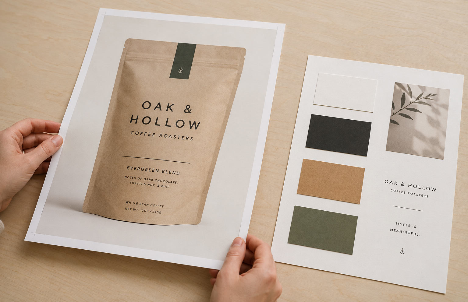
Color choices in minimalist packaging are not arbitrary. The brands getting this right are choosing colors for emotional and categorical signaling first, and personal preference second. The palette defining 2026 minimalist coffee and food packaging leans consistently toward a specific range. Research shows that 90 percent of consumers make rapid judgments about a product based on color alone, which means color in a minimal design is not decorative. It is doing the primary communication work in the fraction of a second before any text is processed.- Warm neutrals: cream, oat, warm white, and natural kraft that communicate authenticity and craft production
- Earthy mid-tones: sage green, terracotta, muted ochre, and stone that signal natural ingredients and environmental awareness
- Single dark anchors: charcoal, near-black, deep forest, and navy that add weight and premium positioning without visual aggression
Sustainability and Minimalism: Two Trends Working Together
Minimalist design and sustainable packaging materials are not separate conversations in 2026. For the coffee and food categories, they have merged into a single consumer signal that reinforces both brand values simultaneously. A kraft paper bag with a clean layout communicates environmental intent before a customer reads the word "compostable" anywhere on the surface. The material and the design are telling the same story. Matte finishes, natural paper textures, uncoated surfaces, and the absence of heavy metallic varnishes all read as deliberate sustainability choices, even without certification language. The visual vocabulary has become a shorthand that a significant portion of specialty food shoppers can read without prompting. The business case for combining these two signals is measurable. Products marketed as sustainable are growing 28 percent faster than conventional counterparts in their categories. Brands using compostable packaging show a 34 percent customer return rate compared to 27 percent for those using traditional materials. Layering a minimalist design approach over a genuinely sustainable material choice compounds both effects, because the visual and the material are reinforcing the same message rather than pulling in different directions. EU regulations through the Packaging and Packaging Waste Regulation are also pushing brands in this direction. Companies operating in or shipping to European markets face growing pressure to reduce print coverage and overall material complexity. Brands that have already committed to minimalist design are finding that regulatory compliance argument easier to satisfy because they were already moving toward reduced ink coverage and cleaner material choices before the rules required it. For coffee and food brands working toward this direction, the practical path is to let the material do part of the design work. A natural kraft pouch does not need heavy print coverage to look intentional. It needs a clean layout that respects the texture beneath it. A matte white bag does not need layered varnishes to look premium. It needs well-set type and restraint.How Specialty Coffee Is Leading the Shift
Specialty coffee has been ahead of the mainstream food industry on minimalist packaging for at least five years, and the influence is now moving in both directions as food brands observe what has worked in that category and adapt the approach to their own products. The roasters building the most design-forward, minimal bags are not cutting corners. They are making precise decisions about what belongs on the bag and enforcing that discipline at every step of the design process. Death Wish Coffee uses hand-stamped logos and handwritten roast dates on matte black kraft bags, combining the visual cues of craft production with a near-anti-design aesthetic that registers as both bold and restrained at the same time. Parlor Coffee Roasters in Brooklyn built a neighborhood series where each bag features artist-designed minimalist imagery specific to a New York location, keeping the visual concept simple enough to register at a glance in a retail environment. The approach has a name in professional design circles: Neo-Minimalism. It retains the structural simplicity of traditional minimalism but introduces warmth through material choice, texture, and a single controlled accent element. A metallic foil mark on an otherwise plain kraft bag. An embossed logo on a matte surface with no other graphic elements. A hand-drawn illustration on a clean white bag with generous margins around it. These are not complex designs. They are minimal foundations with one deliberate detail that earns its place on the surface. Neo-Minimalism is the version of this trend that resonates most strongly in specialty retail because it avoids the coldness that flat, fully stripped-down design can sometimes produce. The warmth comes from the detail and the material, not from adding visual elements back in. This is why a roaster can use a kraft substrate, a single embossed mark, and large type and arrive at a bag that feels both modern and grounded, both minimal and warm.What This Means for Food Brands Beyond Coffee
The minimalist packaging shift applies directly to food brands operating outside of coffee, and the categories moving fastest are the ones with the strongest sustainability and natural quality positioning. Artisanal snack brands are moving away from multi-layered plastic wrappers with loud, competing graphics toward single-material paper or compostable film bags with clean, focused layouts. Meal kit and prepared food brands are using compact recycled cardboard with minimal print coverage. Premium granola, nut butter, spice, protein supplement, and wellness powder brands are all exploring how a less-is-more design approach signals product quality and brand confidence to a shopper who is reading the packaging as carefully as the ingredient list. Food packaging in 2026 is being evaluated by consumers at a more sophisticated level than a decade ago. The shopper who buys specialty coffee, reads every ingredient, and pays attention to where their food comes from is also reading the visual design of the bag as a trust signal. A clean, minimal layout tells that shopper the brand is confident and focused, not hiding product complexity or quality issues behind visual busyness. That same audience is also generating organic discovery content. The flat lay photography and shelf photography that drives product discovery on social media performs best when the packaging has generous white space, a simple composition, and two or three strong visual elements. Minimalist packaging is built for the camera, whether the brand planned it that way or not. A clean bag photographs beautifully in natural light with no styling required, which means every customer who photographs a product on a shelf or at home is doing visual marketing work for the brand.Applying This Direction to Your Packaging
Moving toward minimalist packaging design does not require starting from zero. It requires an honest audit of what is currently on the bag and a disciplined process of removing or simplifying what is not earning its place. The most common elements that cluttered packaging can remove without losing brand identity are the ones that exist out of habit rather than strategic intent:- Secondary taglines that repeat what the product name and category already communicate
- Benefits copy written for a website audience, not a shelf audience
- Multiple competing typefaces used in proximity without a clear hierarchy reason
- Color blocking that divides the bag surface into competing zones that fight each other visually
- Varnish and finish effects applied broadly across the surface rather than used as a single accent element at the brand mark or a key word
The Quiet Shelf Strategy That Gets Loud Results
The brands that figure out minimalist packaging design before their category saturates with it will hold the shelf position the longest. Once every brand in a category goes minimal, the advantage diminishes. Right now, in most food and coffee subcategories, there is still meaningful space to be the clean, confident brand in an aisle of competing noise. Minimalist packaging design in 2026 is not a retreat from shelf competition. It is a precise answer to a specific moment where consumer trust, sustainability expectations, and visual clarity are converging into a single purchase signal. Specialty coffee proved the model at the premium level. Food brands across categories are following the same logic. And the shelf data is confirming what specialty retail figured out years ago: less, done with intention and discipline, sells more.Why Us?
 3x SCA Best New Product Award Winner
Industrial Compostable Packaging
Your Very Own White Label Mobile App
Pono Collective: Providing Coffee Education
Lower MOQs With Our Digital Print Process
Setting Trends While Elevating Your Brand
Contact Our Team!
Other Blogs of Interest


What is the Best Color for a Coffee Brand?
The Power of Color in Specialty Coffee Branding In the competitive world of specialty coffee, the role of color is pivotal. It goes beyond mere aesthetics; it becomes a statement. The right color for your branding can evoke emotions, convey a message, and ultimately create a lasting impression. Ou...


Kraft Coffee Bags: When Natural Paper Packaging Is the Right Call for Your Brand
Walk through a specialty coffee shop or a Saturday farmers market, and the kraft coffee bag tends to be the one that pulls your attention first. The brown paper exterior, matte and textured, gives a product a handcrafted quality that polished foil bags do not always match. Kraft coffee bags have earned...

Your Custom Coffee Bag Deserves Great Artwork: Brief a Graphic Designer the Right Way
Why the Brief You Write Is More Important Than the Designer You Hire A great designer working from a poor brief will still produce work that misses the mark. An average designer working from a thorough brief has a much better shot at nailing it on the first try. Think of the brief as a map. The mor...


Coffee Bags by Region: Why They Look So Different
How Coffee Bag Designs Reflect Where They Come From No two regions brand their coffee the same way, and that’s intentional. Coffee bag designs are shaped by climate, culture, and audience. Think of it as visual storytelling for your morning brew. Latin America: Earthy and Organic Latin Ameri...