

White, Black, Kraft, Pink, or Green: How to Pick the Right Stock Bag Color for Your Product
Overview
Before a customer reads your product name, checks the weight, or flips the bag to find the ingredients, they have already made a judgment. The color of your bag did that. Stock coffee bags come in white, black, kraft, pink, and green, and each one sends a different signal to a different buyer. Picking the right base color is not a personal preference decision. It is a branding decision, and the brands that get it right move product faster, photograph better on social media, and build shelf recognition without ever printing a single full custom run. Stock bags are available in stand-up and quad seal formats in all five of these colors, which means you can choose a shape and a color combination that matches both your product and your customer before you commit to anything beyond a label. This guide walks through what each color communicates, which product categories each one suits best, and how custom stickers and 3D UV printing interact differently with each base.Why Color Is the First Conversation Your Bag Has
There is a well-documented principle in consumer psychology that says color accounts for up to 90 percent of an initial product judgment. That judgment happens in a fraction of a second, before any text is processed. In a retail environment or an online product photo, your bag color is doing the introduction while everything else is still waiting to be noticed. For brands using stock bags, this dynamic is actually an advantage. Because a stock bag is a uniform, clean surface without competing design elements, the base color carries all of that first-impression weight cleanly and clearly. There is no clutter to dilute the signal. A matte black bag reads as premium. A natural kraft bag reads as artisan and eco-conscious. A white bag reads as clean and versatile. The color speaks before your logo, your copy, or your price point gets a chance to. Understanding what each of the five stock bag colors communicates to a shopper gives you a real decision-making tool for choosing which bag fits your product and your buyer.White: The Clean Slate That Works for Almost Everything
White is the most versatile base color in the stock bag lineup, and it is also the most commonly chosen by new brands for good reason. It communicates cleanliness, simplicity, and quality without implying any specific product category. That neutrality is a genuine strength. White stock bags perform across a wide range of products. Loose leaf teas, supplement powders, light roast coffees, wellness blends, and artisan candies all photograph beautifully against a white base. The color pairs naturally with minimalist design thinking: a clean label, a bold logo, and generous white space around the product name is all it takes to produce a retail-ready package on a white bag. White is also the most label-friendly base of the five. Whether you are applying a printed sticker label or going with a 3D UV print directly on the bag, the white surface reflects light evenly and reproduces colors accurately. A UV-printed logo in gold or deep navy on a white bag reads as sharp and intentional. A color-printed sticker on white disappears into the bag surface cleanly, giving the package a finished look without the seam or edge of the label calling attention to itself. The one place white underperforms is in very high-premium positioning for darker or more intense products like dark roast espresso, bold spice blends, or high-cacao chocolate. For those categories, the color can read as too neutral, too clinical, or too light to carry the product's character. That is where black takes over.Black: The Premium Signal That Sells Itself
Matte black is the strongest premium signal available in a stock bag. It communicates quality, confidence, and sophistication before a single word on the bag is read. It is not a safe choice the way white is. It is a deliberate positioning choice, and for the right products it is one of the most effective tools a small brand has. Black stock bags perform best for dark roast and espresso coffees, bold spice blends, protein powders in high-performance fitness positioning, cacao products, and specialty confections marketed as luxury or gift items. The bag carries a high perceived value out of the box, which means your label or branding detail does not have to work as hard to establish premium positioning. The bag does it for you. For branding on black bags, contrast is everything. A white, gold, or silver custom label or UV-printed mark on matte black creates a striking combination that photographs exceptionally well, especially in the flat lay and overhead compositions that drive product discovery on social media. A 3D UV print on black is particularly effective because the dimensional finish on a dark background creates a tactile and visual richness that is immediately noticeable without requiring any text to explain it. The consideration with black is audience fit. For products aimed at natural food buyers, eco-conscious consumers, or audiences who associate dark packaging with artificial or processed goods, black can work against you. Know your buyer before committing to a matte black base.Kraft: The Artisan Signal That Earns Trust Without Trying
Natural kraft is the go-to base color for brands that want to communicate authenticity, craft, and environmental awareness simultaneously. It is the packaging equivalent of a handwritten label on a jar from a farmers market. Shoppers who reach for kraft packaging have already decided they care about how something is made and where it comes from. Kraft stock bags work exceptionally well for single origin coffees, organic teas, artisan snack foods, granola, loose herbs and spices, and any product that benefits from a natural or minimally processed association. The paper texture of a kraft bag reinforces the unprocessed quality message in a way that printed colors alone cannot replicate.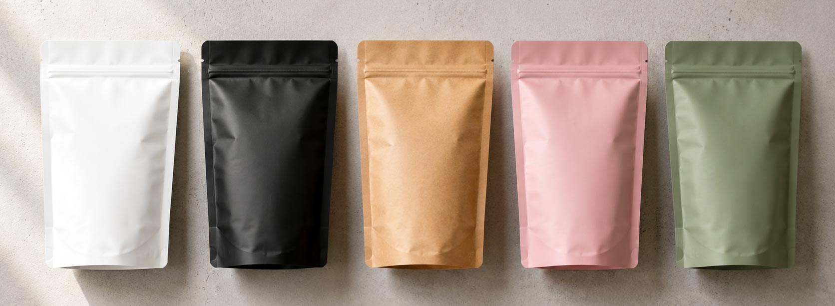 From a branding standpoint, kraft is forgiving and flexible. Dark ink labels in black, forest green, or deep burgundy sit beautifully against the warm brown base. A simple white sticker label on kraft reads as intentional and clean. UV printing on kraft tends to produce deeper, earthier tones than on white or black, which actually complements natural product positioning rather than working against it.
Kraft bags also photograph well in natural light settings, which are the most common format for food and coffee product photography. A kraft pouch on a wood surface with a linen napkin and a small plant reads as a complete product lifestyle photo with almost no styling required.
One practical note: kraft is slightly more absorbent than the film-based white or black bags, so UV prints should be tested on the specific material before committing to a large branded run. Sticker labels are the more predictable choice for kraft if you are launching quickly.
From a branding standpoint, kraft is forgiving and flexible. Dark ink labels in black, forest green, or deep burgundy sit beautifully against the warm brown base. A simple white sticker label on kraft reads as intentional and clean. UV printing on kraft tends to produce deeper, earthier tones than on white or black, which actually complements natural product positioning rather than working against it.
Kraft bags also photograph well in natural light settings, which are the most common format for food and coffee product photography. A kraft pouch on a wood surface with a linen napkin and a small plant reads as a complete product lifestyle photo with almost no styling required.
One practical note: kraft is slightly more absorbent than the film-based white or black bags, so UV prints should be tested on the specific material before committing to a large branded run. Sticker labels are the more predictable choice for kraft if you are launching quickly.
Pink: The Gifting Color That Opens a Different Market
Pink is the most specialized base color in the stock bag lineup, and that is precisely what makes it powerful for the right products. It signals playfulness, warmth, sweetness, and occasion in a way that no other bag color does. Shoppers looking for a gift, a treat, or something that feels celebratory respond to pink packaging at a different emotional register than they respond to any other color. Pink stock bags are the natural choice for flavored coffees, floral and fruit-forward teas, confections, hard and gummy candies, cocoa and drinking chocolate mixes, and any product intended for gifting or seasonal purchase. If your product sits at the intersection of food and occasion, pink opens a market segment that a white or kraft bag simply cannot reach. Branding on pink bags should lean into the warmth and personality the color already brings. Rose gold UV printing on pink is an exceptionally high-performing combination for premium gifting products. A white or cream label on a soft pink base reads as elegant and deliberate. Avoid heavy dark ink labels on pink, as the contrast tends to undercut the lightness that makes the bag appealing in the first place. Pink also performs well as a limited-edition or seasonal colorway for brands that carry their core product in a different base color. A roaster that primarily sells in kraft can release a Valentine's Day or spring seasonal blend in a pink stand-up with a custom sticker and generate real visual differentiation on shelf without any changes to their production workflow.Green: The Health Signal That Grows Faster Than Any Other Category
Green is the packaging color most strongly associated with health, wellness, and natural ingredients, and it is performing exceptionally well right now as those product categories grow faster than any other segment in specialty food and beverage. Green stock bags are the natural fit for matcha, green and herbal teas, adaptogen and wellness blends, organic supplements, botanical powders, and any product that wants to lead with its health or natural origin credentials. The color does heavy lifting in the first impression for buyers who are actively shopping in the wellness category. Lighter sage greens communicate a gentle, botanical quality that suits floral and herbal products especially well. Deeper forest greens read as more substantive and earthy, which works well for protein and supplement powders, coffee alternatives, and bold herbal blends. Both shades of green perform well across both stand-up and quad seal formats, and the color photographs cleanly in both studio and natural light settings. For branding on green bags, white and cream labels or UV prints create a clean, modern contrast that reads as confident without looking clinical. Gold on dark green is a particularly strong combination for premium herbal or wellness positioning. Avoid neon or highly saturated complementary colors in your label design, as they tend to fight the earthy wellness signal the green base is creating.Stand-Up or Quad Seal: How Bag Shape Changes the Color Equation
Choosing a base color and a bag style together, rather than separately, gives you a stronger shelf presence than either decision made in isolation. Stand-up pouches in white or kraft read as approachable and accessible, which suits brands selling at a moderate price point or targeting the everyday specialty coffee and tea buyer. A stand-up in black signals premium quality and works well for shelf display or gift shop placement. Stand-ups in pink are particularly effective for the gifting and boutique retail market because the bag shape itself suggests an occasion when paired with the right color. Quad seal bags have a more structured, upright profile that communicates seriousness and quality across all five colors. A quad seal in black or dark green on a shelf reads as a premium, professional product before anything else. A quad seal in kraft on a natural food shelf fits the category precisely. For food packaging applications beyond coffee, the quad seal format also provides a wider front panel, which gives custom sticker labels or UV-printed branding more surface area to work with.How Stickers and 3D UV Printing Work on Each Color
The ability to apply custom sticker labels or 3D UV printing directly to a stock bag is what turns a blank base into a branded product without a full custom production run. How well that branding reads depends significantly on the base color it lands on. Custom sticker labels are the fastest and most flexible branding path for stock bags. They work well on all five base colors, with white and black producing the sharpest contrast results and kraft requiring a slightly thicker label stock to prevent show-through from the texture beneath. A well-designed sticker on a clean stock bag can be nearly indistinguishable from a fully printed custom bag in a retail setting, especially when the label is die-cut to fit the front panel proportions naturally. 3D UV printing applied directly to the bag surface produces a dimensional, raised finish that reads as a premium production detail. On white, the effect is crisp and modern. On black, it is visually dramatic and tactile in a way that photographs exceptionally well. On kraft, it produces a rich, textured result that complements natural product positioning. On pink or green, UV printing adds a layer of sophistication that elevates the bag from a stock item to a designed product in one step. For brands using digital packaging runs or testing a new product before committing to a full custom order, the combination of the right stock bag color and a strong sticker or UV-printed branding element is often enough to launch, test, and sell a product at a retail-ready quality level. Many brands that start this way and find product-market fit then move to a custom coffee bags production run with a design they already know works on shelf.The Color Decision You Make Before the Design Decision
Choosing a stock bag color is not a design step. It is a strategy step. It determines which customers your packaging speaks to first, which product shelf or category your bag fits into naturally, and which branding approach will produce the strongest result on your specific base. White is for versatility and accessibility. Black is for premium and specialty positioning. Kraft is for craft, organic, and natural market appeal. Pink is for gifting, occasions, and confectionery. Green is for health, wellness, and botanical products. Each color has a category where it performs at its best, and knowing which one matches your product and your buyer before you commit to any label or print treatment is the most efficient decision you can make at the start of a packaging project. Get the base color right and the rest of the branding work becomes easier, cleaner, and more effective at every step after it.Your Bag Color Speaks First. Make Sure It Says the Right Thing.
The five stock bag colors available in stand-up and quad seal formats are not just aesthetic options. They are brand positioning tools, each one calibrated to a specific audience, a specific product category, and a specific shelf moment. A brand that chooses its base color with intention starts every customer interaction ahead of the brands that chose it by default. If you are launching a new product, testing a new SKU, or entering a new product category for the first time, choosing the right stock bag color is the lowest-cost, highest-leverage decision in the entire packaging process. Get it right before you design a label, before you print anything, and before you put a bag on a shelf or in a photo. The color does the talking first.Why Us?
 3x SCA Best New Product Award Winner
Industrial Compostable Packaging
Your Very Own White Label Mobile App
Pono Collective: Providing Coffee Education
Lower MOQs With Our Digital Print Process
Setting Trends While Elevating Your Brand
Contact Our Team!
Other Blogs of Interest


Kraft Coffee Bags: When Natural Paper Packaging Is the Right Call for Your Brand
Walk through a specialty coffee shop or a Saturday farmers market, and the kraft coffee bag tends to be the one that pulls your attention first. The brown paper exterior, matte and textured, gives a product a handcrafted quality that polished foil bags do not always match. Kraft coffee bags have earned...


Custom Coffee Bags Explained: Stand Up Pouches
Stand Up Pouches have been a favorite for roasters and customers for many years. Its design to stand upright on shelves offers the perfect balance of practicality and presentation for many businesses. Why Choose Stand-Up Pouches? This bag style is known for its "more bang for its buck" due to it...

How Hotels Can Build a Branded Coffee Program With Custom Private Label Packaging
Your Hotel Has One Shot at a First Impression. Make the Coffee Count. When a guest walks into their room and sees a small bag of coffee sitting on the credenza, they are not just looking at a beverage. They are reading a message about your brand. That little bag tells them whether you put thought in...


Stock Coffee Bags and Custom Packaging Boxes: The Perfect Pair
Stock bags and custom boxes can help brands Stock bags offer a commitment-free and low minimum order quantity at a more affordable price. If you're looking for a personalized look custom boxes are great alternative to the higher minimum required for custom bags. Keep overall packaging costs l...