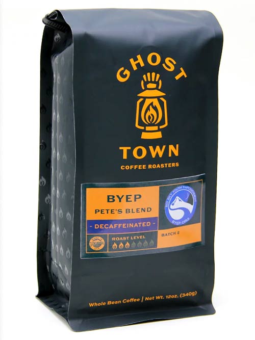
Design turns a group of packages into a true breakfast block. A shared color palette across coffee, granola, and cereal makes the set pop from down the aisle without feeling loud or messy. Accent colors can signal flavor groups, such as warm tones for nut and spice, cool tones for berry, and neutral shades for classic blends. Simple icons, like mugs, grains, or suns, can repeat across bags and boxes to link the story. Matching matte films or soft touch varnish give a unified feel when shoppers pick up each item. Smart layout keeps key details in the same places, so eyes always know where to find roast level, flavor notes, and nutrition facts. QR codes placed in a consistent spot on every pack can link to brewing guides, pairing tips, and rewards inside the Savor Live platform. Little by little, the breakfast shelf turns into a billboard for your brand instead of a random mix of products.
Breakfast Packaging Checklist
- Use high barrier materials for coffee, granola, and cereal
- Add resealable features that support daily opening and closing
- Plan windows that show product while limiting light exposure
- Keep front panel information simple and easy to scan
3x SCA Best New Product Award Winner
Industrial Compostable Packaging
Your Very Own White Label Mobile App
Pono Collective: Providing Coffee Education
Lower MOQs With Our Digital Print Process
Setting Trends While Elevating Your Brand


3x SCA Best New Product Award Winner
Industrial Compostable Packaging
Your Very Own White Label Mobile App
Pono Collective: Providing Coffee Education
Lower MOQs With Our Digital Print Process
Setting Trends While Elevating Your Brand