Bold Bags Brew More Attention
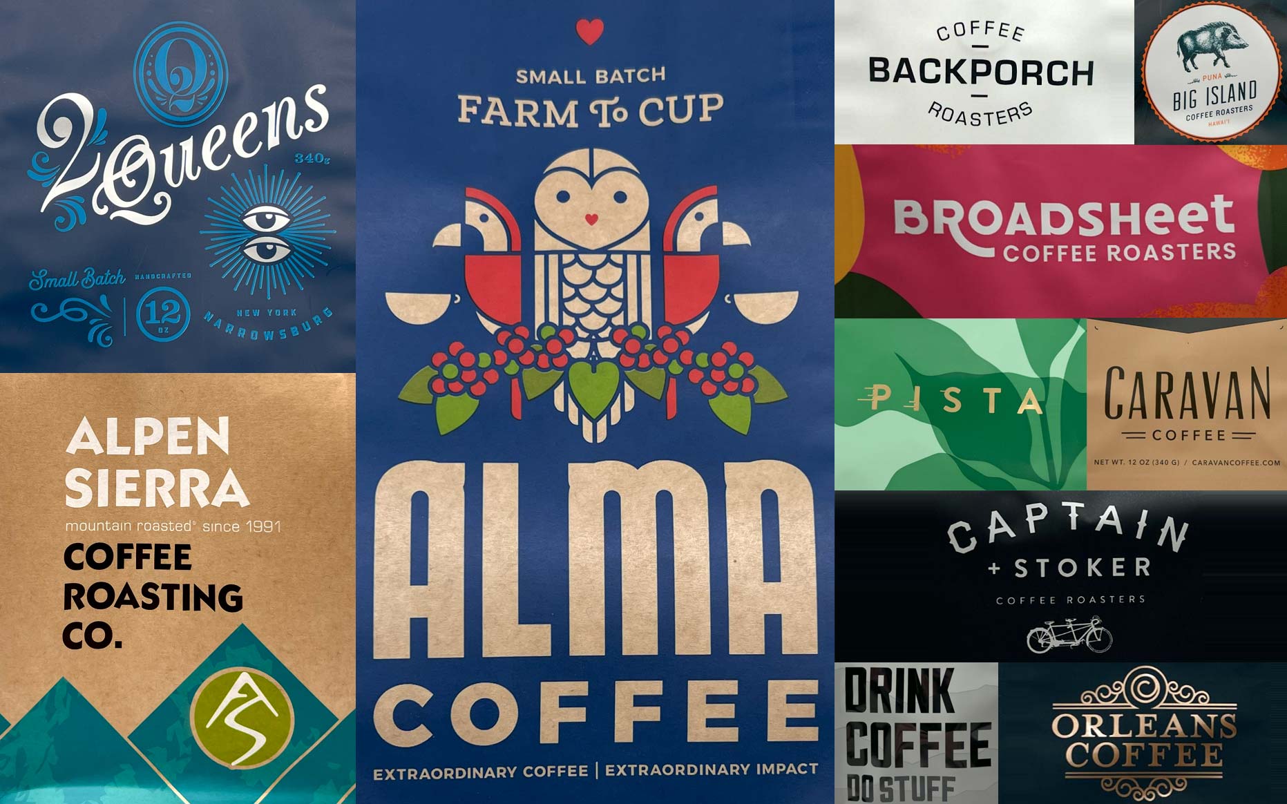
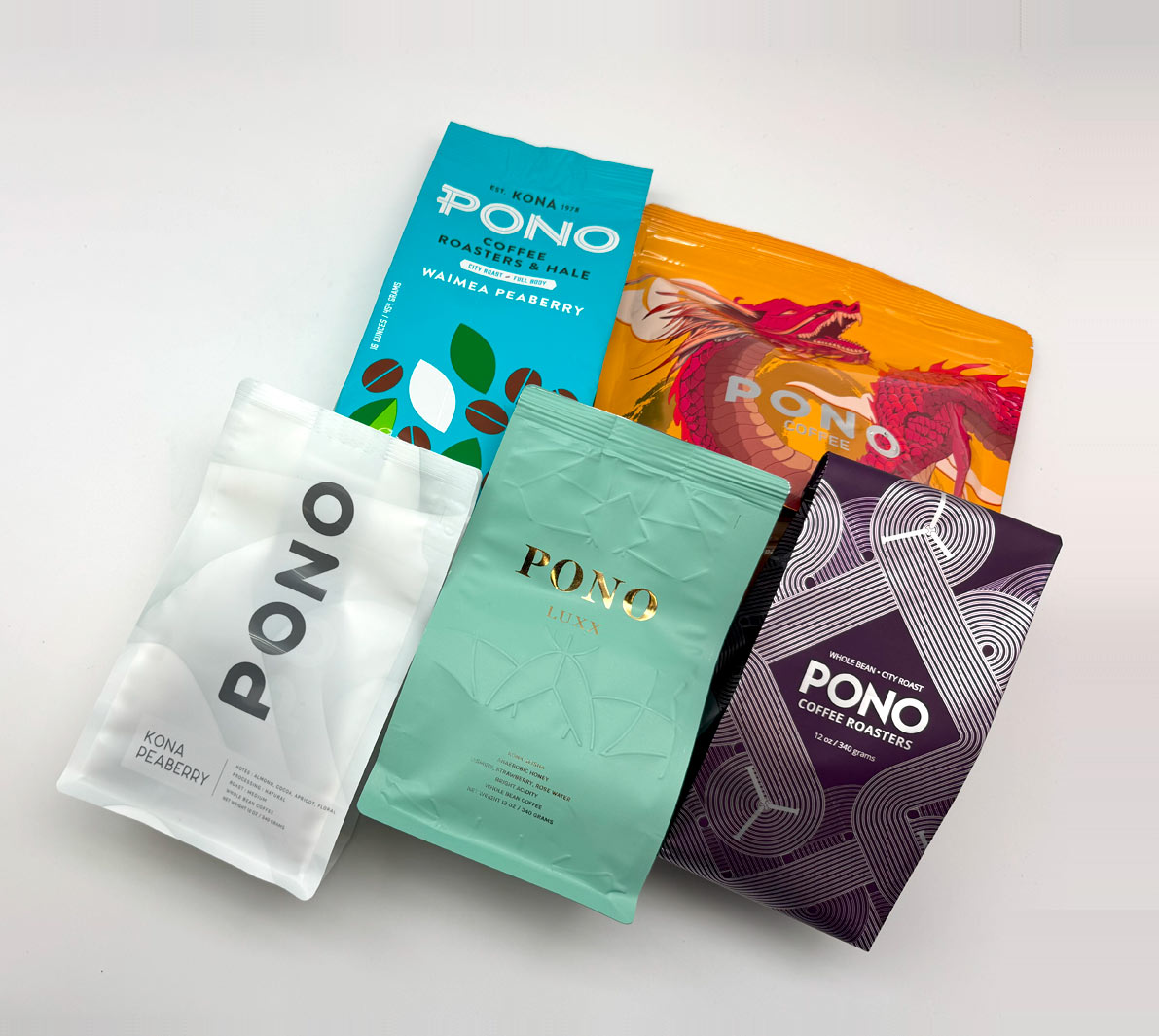
In a crowded coffee aisle, package color and finish can make or break a shopper’s first look. Bold hues grab attention fast, and the right material helps those inks look crisp and rich. Using the shelf photo as our guide, the bags that jump out first are bright yellow, then red, followed by solid orange, and finally the bag with the hula dancer illustration.
Why Standing Out Matters
- Shoppers scan shelves in seconds. High contrast colors stop the eye.
- Strong visibility and unique design increases the chance a shopper picks up the bag.
- More pickups lead to more customer interest, which can raise sales.
- Distinct color also helps shoppers find the same brand again later.
Do Materials Make Ink Colors Pop?
Yes. The bag surface changes how colors look.
- Glossy film reflects light and makes colors look sharper.
- Matte film softens reflections, which can mute bright tones.
- Natural kraft can warm or dull inks, which fits rustic designs.
- Metalized or foil laminates add reflectivity that can boost contrast.
Which Coffee Bag Stands Out Most in the Photo?
- Based on the shelf image:
- Bright yellow bag is the most eye catching.
- Red bags come next for quick visibility.
- Solid orange bag follows with strong contrast.
- Hula dancer design follows. The artwork is compelling and clean rather than busy, but it still does not hit with the same power as the bright colors.

What Helps a Bag Pop on Shelf
- Big areas of saturated color
- Simple, large text with high contrast
- Unique bag silhouette
- Clear brand mark placed near the top
- Clean shapes that are easy to scan from a distance
Quick Tips for Coffee Brands
- Use one dominant color so the bag is recognizable from across the aisle.
- Choose a finish that matches the goal. Gloss for punch, matte for premium calm.
- Keep key claims in bold, high contrast type.
- Test on real shelves to see what catches eyes first.


